RSS |

Trend Technician

Just another WordPress weblog

Advertisement

Archive for the ‘ Course ’ Category

This article is part of the Trend Technician Technical Analysis Basics series. Be sure to read the rest of the series.

The most commonly used indicator by far is the moving average. Its value is easy to understand intuitively and one of the least controversial indicators. Almost any trader will agree to the value of moving averages.

Moving Average Basics

A moving average represents the average value of an issue over a trailing window.  All moving averages are designated in terms of a time span for how many days of trailing data should be included in the average.  For example, 10 day, 50 day and 200 day moving averages are commonly used.  There are however several ways to calculate this average.  The two most common are the simple moving average and the exponential moving average.

Simple Moving Average

The simple moving average is the most obvious type of moving average.  For an X day moving average you simply total the values of the previous X days and divide by X.  However, in addition to being simple, this method of calculation is somewhat volatile.  The fact that all days are given an equal impact on the average leads to a high sensitivity to the value that has just dropped out of the window.

Exponential Moving Average

In an exponential moving average, or EMA the weight of each piece of data decays as it gets farther from the present.  While much harder to calculate, these tend to give results that are less subject noise.  The impact of each day decays exponentially as it gets farther from the present and thus the most recent data is the most influential.

Trading with Moving Averages

Using these moving averages is fairly straightforward.  In general you want to be trading in the direction of the moving average, however there are some caveats:

When price has deviated particularly far from its moving average, there is a good chance it will return and “touch” the MA again.  This deviation can be a good opportunity to take profits and re-enter the position when it returns to the moving average.

When a price crosses a moving average, this can indicate a change in trend direction.  Many traders will use this as an indicator for a trend change.

Moving averages are integral to trading and are also pivotal in calculating other indicators.  They are the basis of most numeric analysis of stocks and understanding them is very important.

This article is part of the Trend Technician Technical Analysis Basics series. Be sure to read the rest of the series.

The final component of a classical charting education is the study patterns.  Chartists can name a bewildering array of patterns and it would be ridiculous to try to cover them all.  Moreover it’s not clear that they provide as much value as their proponents might argue.  That being said, there are several basic patterns that are routinely discussed and are worth noting.  If nothing else the fact that people believe in these patterns means they will likely have some merit.

Gaps

Gaps occur when the low of a day is higher than the high of the previous day, or the high of a given day is lower than the low of the previous day.  They are quite easy to see on charts and they tend to stand out.  Gaps often occur on the heels of news or other outside influences, however they can be mysterious.

Typically gaps indicate a burst of momentum in a given direction.  However they can also indicate an aberration that will be corrected.  The conventional wisdom in telling the difference is that gaps that are followed by new extremes in the same direction are indicators in that direction, while those that do not make new extremes will usually “close the gap.”  So if a stock gaps up and subsequently makes new relative highs, then the gap is considered to be “confirmed.”  If on the other hand the stock fails to make new relative highs, it’s likely that the stock price will return to pre-gap levels.

Other Patterns

There are a myriad of other patterns.  We may cover them in more detail in individual articles, but they are of less use than basic support, resistance and trend analysis in the author’s opinion.  Some of the more common ones like the head and shoulders or double top/bottom can be useful tools, but others can be nearly a Rorschach test, where the investor can see what he or she wants to see.  Here is a brief list of some of the more common patterns:

  • Head and Shoulders
  • Lines
  • Flags
  • Triangles
  • Rectangles

Each of these may have some merit, but I recommend using more clear cut indicators in addition to these in your analysis.

This article is part of the Trend Technician Technical Analysis Basics series. Be sure to read the rest of the series.

Once we understand the concepts of support and resistance we can talk about the two basic states a trend can be in: A trading range and a trend.

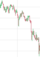
A Downtrend -- Note the lower highs as well as the lower lows.

A Downtrend -- Note the lower highs as well as the lower lows.

A trend exists when prices are moving in a direction.  When prices are consistently becoming higher, you are in an uptrend and when prices are consistantly lower you are in a downtrend.  This distinction may sound arbitrary but the basic definition is that when prices are reaching higher highs and higher lows then the price is moving upwards and vice versa for downwards.  When prices are not trending they are considered to be in a trading range. In this state, most prices hit roughly the same highs and the same lows.

Obviously these defintions only make sense in terms of a timespan.  A particular issue can be in a long-term uptrend, but a short term downtrend.  This is usually defined by what time period a bar represents on a graph and what kind of timespan in which you are planning on executing your trade.  Moreover traders oftentimes tend to avoid issues when they are in a trading range, however this can be a great opportunity to profit using options.

Trading Trends and Trading Ranges

The rules of trading trends are fairly obvious.  You very rarely want to trade against the trend for the timespan in which you are investing.  While you might trade against a long-term trend if you plan on holding for only a short period of time, or against a short-term trend if you’re planning on holding for a long period of time, typically you want to trade with the trend.  Additionally, profit taking can be very difficult in trading ranges.

Triple Call Technique

September 19, 2009 | No Comments | Course

You’ll find that most techniques for trading are not rocket science. In fact most of the difference between traders who make money and traders who lose money is about discipline, not about technique. That being said, there are some approaches that I feel can help broaden your toolbox and could be a missing component for some traders. Today I’m going to talk about what I call the “Triple Call Technique.”

I utilize this approach in several situations:

  • One is in a market like now, where I lack conviction and I feel that overall the issue I’m looking at might be trading in a line.  In cases where I’d like to go long something, but I’m feeling very risk averse this method can be great.  It works particularly well going long on issues that pay a high dividend.
  • Another is when I’m looking to hedge a position.  Typically when I’m hedging I’m trying to pick the issue most likely to benefit if I’m wrong and give myself a small upside on that position.  This can also be useful in markets like today’s where I tend to lack conviction in any fundamental sense.
  • Finally I can use this in auto-trading systems where I’m trying to build up a position in something over time.  I have a tendency to employ this with ETFs to gain exposure to a certain position over time.

Ultimately the crux of the system is pretty simple.  Let’s assume I’m going long but it can be used in exactly the same way to go short.  This only works with stocks and ETFs in which you can sell options, so they typically can’t be thinly traded.  Typically I set up some type of automated system that will notify when certain criteria are met.  One great approach is to use Market Club’s Trade Traingle system and get notifed whenever a particular score is hit.  You could also consider using any indicator or combination of indicators, even something as simple as Moving Average crossovers.  Once my signal is hit, I take my position and then immediately sell calls as follows:

  • 1/3 I sell a deep in the money call.
  • 1/3 I sell a slightly out of the money call.
  • 1/3 I leave uncovered.

If I’m hedging or otherwise particularly skeptical of the position, I will sometimes not take the uncovered position at all.  What you’ve essentially done by doing this is get your cost basis down but severely limit your upside.  If the intent of the position is to hedge another position this can be perfect.  Additionally if this is a position where you’re likely to get out if it runs very far anyway, then a limited upside isn’t really a liability, since it should be offsetting the limited risk as set by your stop.  Meanwhile you’re risk is significantly curtailed.   Let’s take an example from today’s prices:

Suppose I want to gain exposure to international sales to offset a bias in my other trading positions.  To do this I set a series of watches on Market Club to let me know when any of a series of stocks hits a score of 90.  If you’d like to get a FREE score for a stock just sign up here.  As of today PM is has a score of 90, which is a strong uptrend so let’s use that as my buy signal.  Phillip Morris International closed today at $48.18.  Now let’s start with my in the money call.  Assuming we’re using Dec calls, here are my possible selection:

Strike Price Premium Premium/Net Cost Effective Price
$47 $2.65 $1.47 3.23% $45.53
$46 $3.30 $1.12 2.50% $44.88
$45 $3.90 $0.72 1.63% $44.28
$44 $4.70 $0.52 1.20% $43.48
$43 $5.51 $0.33 0.77% $42.67

With these options available, you might be surprised to learn I would take the $43 strike price option. By taking that on 1/3 of my position, I would make 0.88% in 2 months as long as the price stays above 43. If it plummets and goes to $41 then it has brought my price for that block down to $42.67. This makes my hedge less painful if I’m right.

On the second third of my position I would sell a $50 strike price call for $1.20.  Then I would leave the final third uncovered.  The net result of all this is that my average price is $45.94.  Let’s look at what I gain or lose at various prices:

Price $43 Strike $50 Strike No Call Total
40 ($2.67) ($5.94) ($8.18) ($14.12)
45 $0.33 ($0.94) ($3.18) ($3.79)
48 $0.33 $1.02 ($0.18) $1.17
50 $0.33 $3.02 $1.82 $4.84
55 $0.33 $3.02 $6.82 $10.17

As you can see, the net effect is that if the stock goes down a lot we lose less than we would have otherwise. If the stock stays about flat you make more than you would have and if the stock goes up you make less than you would have otherwise. Ultimately it dampens your effects in either direction. If I did this over a significant period of time with automatic trading signals and a selection of appropriate stocks, I could build up significant exposure without nearly as much risk.  When trying to build up a position, or in unconvincing market the key components are:

1.) Using an Automatic Trade Indicator
2.) Selling staggered options on portions of your position.

When hedging you should simply take the position to offset your other positions.  You can see the many applications, especially in environments where you are risk averse.

Photo Credit: Corey Leopold
This article is part of the Trend Technician Technical Analysis Basics series. Be sure to read the rest of the series.

Probably the first type of chart analysis to come into play is the analysis of area areas of support and resistanceSupport is a price level at which buying increases to either pause or reverse a downtrend.  Similarly resistance is a price level at which selling increase to either pause or reverse an uptrend.  This sounds complex, but is really quite intuitive in practice.

For the purposes of this conversation we’ll assume we’re talking about a stock, although this applies to any traded issue.  Intuitively you can imagine that various members of the market see the stock as atractive at a certain level.  As the price gets lower and lower more members start to see the stock as underpriced.  This effects becomes manifest at a certain price at which there doesn’t remain enough selling power to push it down and the price  “bounces off” the support level.  In this chart that price is roughly 87. [More]

This article is part of the Trend Technician Technical Analysis Basics series. Be sure to read the rest of the series.

Price and volume are the two essential pieces of information from which most technical analysis is derived. Volume reflects the activity of participants in a given issue. Each unit of volume reflects two people’s actions — One participant buys a share, contract or other issue and the other sells one. The total number of issues that changed hands is the volume.

Typically on charts volume is represented as vertical bars at the bottom of the chart.  The height of these bars represents the amount of volume for a given period of time.  Typically this histogram appears on a chart below the price data.  Volume can reflect many elements of the market psychology at a given time.

You can actually look at volume in several dimensions:

 
  • The most obvious is the number of shares, contracts or other issues that traded handeds.  This is the most common way to measure volume.
  • Another way to look at volume is simply in the number of transactions that took place.  The size is irrelevant, simply the number of times some number of shares traded hands.  This number can give some insight into the number of participants in a market, but should obviously be taken with a grain of salt and is not widely used.
  • Another way to measure volume is the number of price changes that occurred during a given period of time.  This measurement can be referred to as tick volume.  In this measurement, the number of shares or transactions are irrelevant until the price changes.

Volume is often seens as the primary measure of liquidity in a market.  A market which makes many trades a day typically is viewed as more liquid than one which trades fewer.  Volume is represented in several indicators, but is sometimes ignored by many traders.  It can be an important element in confirming your beliefs on a trade and can be key in analyzing charts.  Be sure to pay attention to volume during your trade lest you get false signals.

Photo Credit: Drab Makyo

This article is part of the Trend Technician Technical Analysis Basics series. Be sure to read the rest of the series.

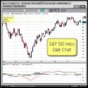
You wouldn’t think that price would merit its own post, but you have to start at the beginning. Price and volume, which we’ll discuss next are the two major components of charts. All the other data is a derivative of these two pieces of data. Price data however is not a simple number. Typically in technical analysis you deal with four distinct price numbers:

  • Open
  • High
  • Low
  • Close

These four numbers are fairly self explanatory, but let’s go over them quickly anyway.  Open is the price at which the issue trades during a given time period.  High is the highest price at which an issue trades during a given time period and low is the lowest.  Close is the final price of the stock during the time period.

You’ll notice that in this discussion I speak in terms of time periods in a general sense.  That’s because charts can have any level of granulatrity.  In an intra-day chart, the period in question may be an hour or even in some cases a smaller fraction of time.  In other charts, the same time period could be a day or a week or even a month.  In any of these cases, however you can still have an open, a high, a low and a closing price.

When charting these prices, you can represent these values in many ways.  Probably the most common type of chart is a bar chart.  In these types of charts, each period is represented by a bar.  The bar stretches from the period’s low to it’s high.  It also has a tick on the left side for the open and a tick on the right side for the close.  There are other types of charts, which we will discuss later.

The price is probably the most important component of any analysis, but it isn’t the only one.  Without understanding volume, which we will discuss next, the price data can be misleading.

Price Data From a Bar Chart

Price Data From a Bar Chart